Dear reader,
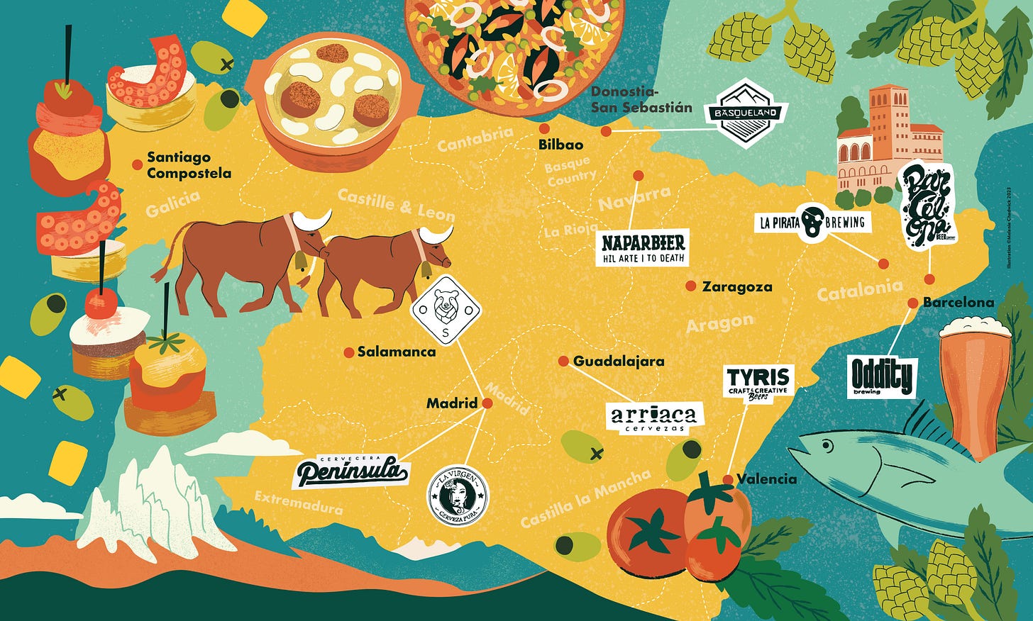
These last few weeks and months have involved a number of map-related projects for regular and new clients. Those of you who follow my work closely will know my regular clients request maps for a range of locations each month. Ferment Magazine, (a beer mag) commissions vector-based colourful maps and Glug Magazine (their sister wine mag) commissions a looser inky, watercolour style of map. Both are focused on the alcohol industry and give the reader an idea of the location in which the beer or wine is produced.
I have now created 23 and 21 maps for these publications respectively and over time have a working method that enables me to get these maps turned around within a tight deadline. However, it does mean because I have trained myself to work under pressure I can sometimes find it hard to motivate myself to do personal work when I don’t have a deadline. It’s probably why I like to give myself mini challenges and write a list of what I need to do each day (more on that in another post). Anyhow here are some of the maps commissioned from the mags this year so far.
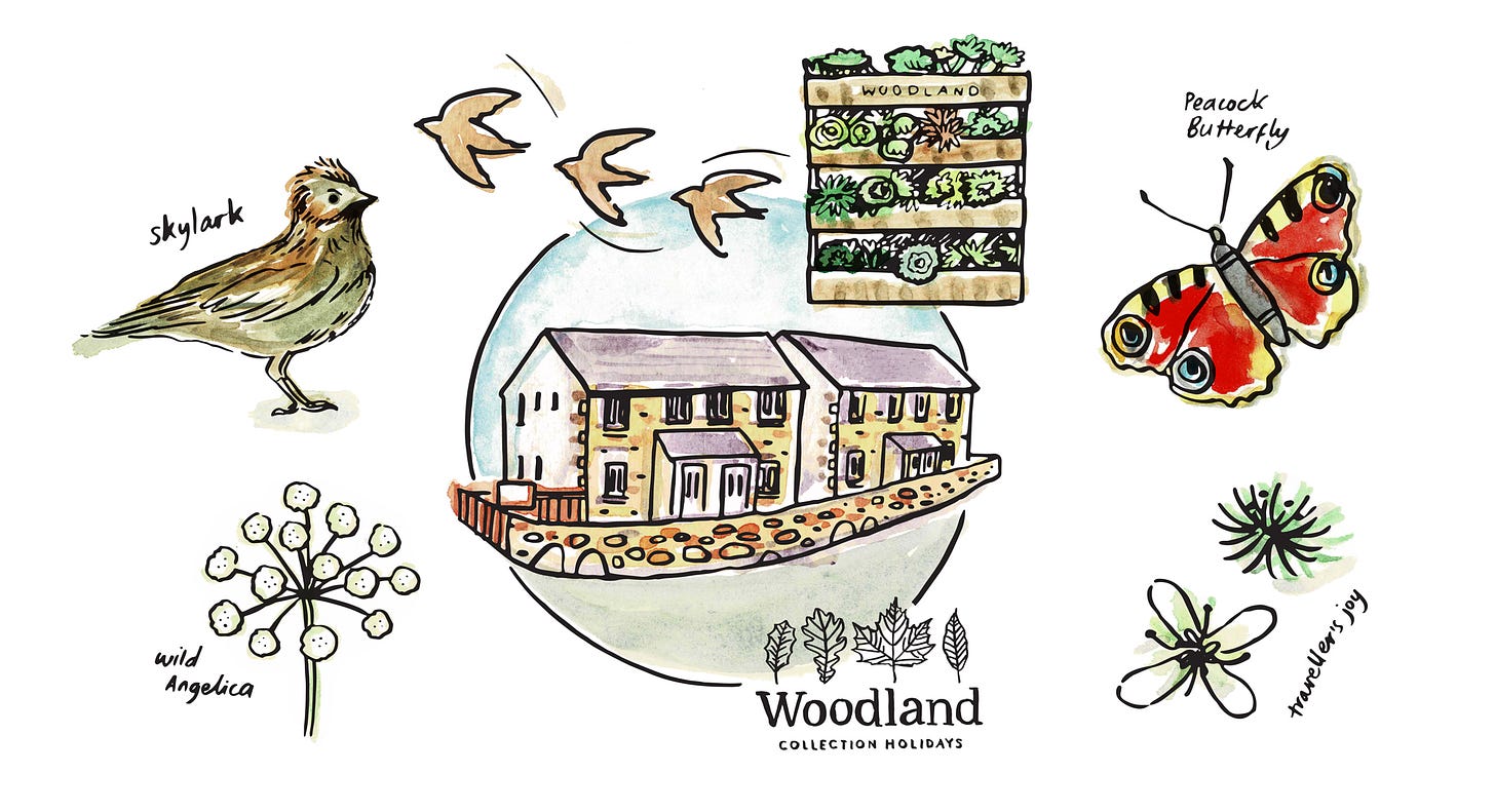
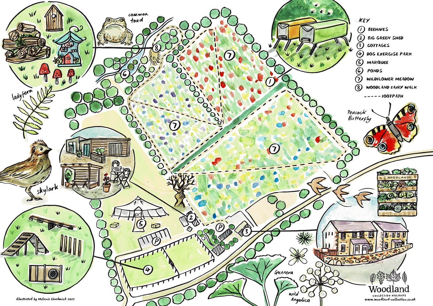
I was approached by a new client in January who commissioned a site map for their holiday cottage farm and wanted to include some of the wildlife that inhabits it.
‘Meadow Browns, Speckled Wood, Red Admirals, Peacocks, Clouded blues and Yellow Brimstones… Sparrows, Swallows, Barn owls, Great Spotted Woodpeckers, and Buzzards’
As they were only situated around a 35 min drive away from me, I arranged to go up one overcast day to do a site visit and spent an afternoon walking the muddy footpaths, discovering fairy homes and waterways in the woods and taking numerous reference photos. I’m usually working remotely on projects with just google maps to go on, so this was a good opportunity to explore on foot. Meeting the client and seeing the place in person also helped quickly inform me on how I’d illustrate the map. We decided to go for soft, natural watercolours combined with brush line work and hand lettering which I think conveys a friendly and slightly whimsical, approachable style.
This looks AMAZING!! I love it as is!
It’s not often that I get such a positive response from my first round but was delighted to know that I had captured what the client wanted. Perhaps visiting in person really did help me.
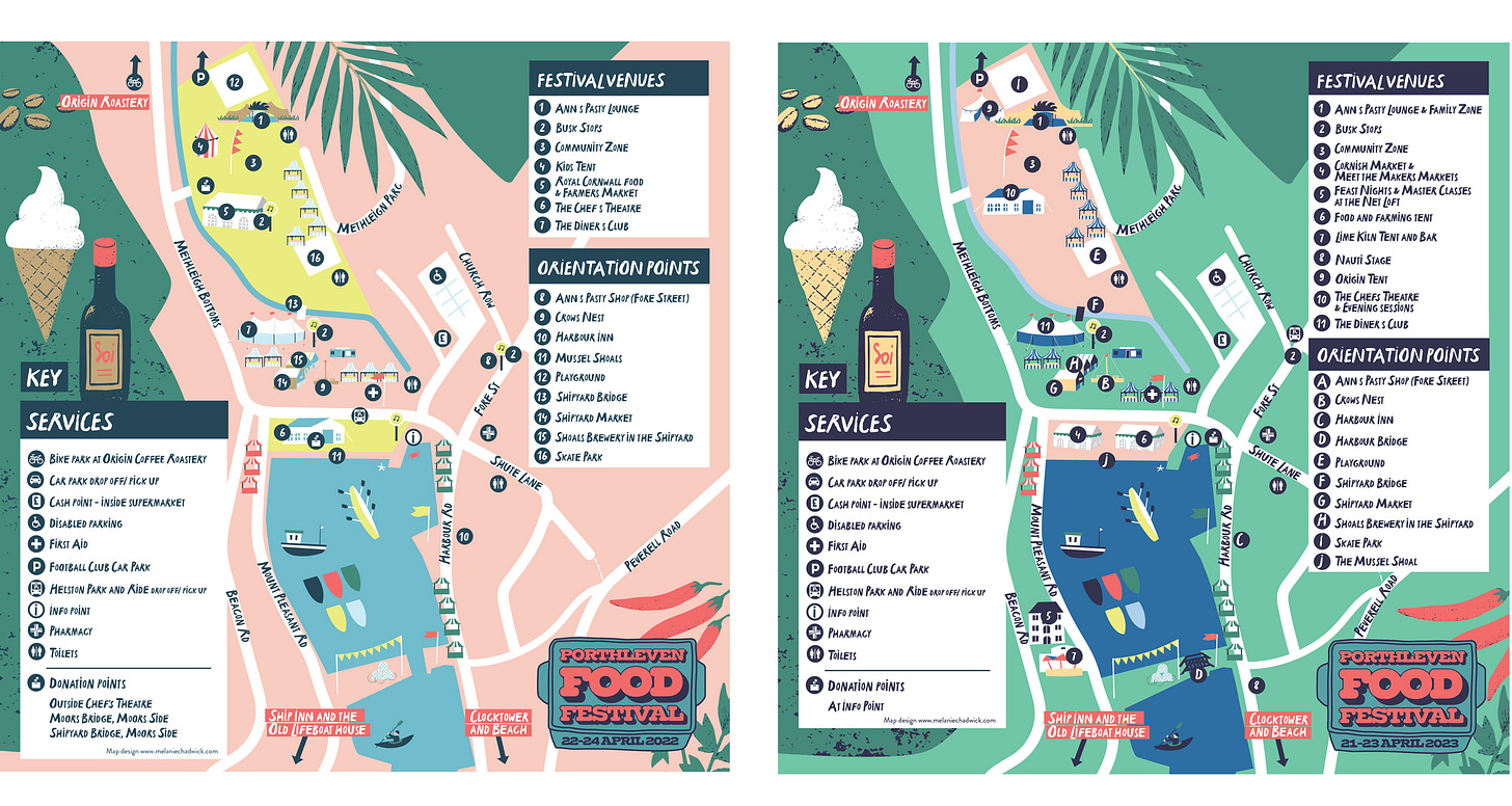
My final map to share is the site map for the Porthleven Food festival. An annual event in the festival calendar that attracts 1000s of foodie folk each year to descend on the harbour town to feast, forage and learn from the many cookery demos, and stalls that share their knowledge and wares.
I worked with the festival last year on the map and so this year was an update to the colour palette and additions to the key. The festival already had its own branding assets so I solely worked on the map and combined it with their logo and illustration. Below are the maps from this year and last year for comparison (and if you like play spot the difference)!
Well, that’s it for now, you’re all caught up on my map activities for the last month or so. I hope you’ve enjoyed seeing my work and I look forward to sharing my next client project update next month. You will be hearing more about my courses and sketchbooks sooner but they’ll be shared in separate posts, so until then, thanks for reading.


Beautiful and inviting map work! Makes me want to visit them so I think you're on point. 🤓
Absolutely wonderful. And so engaging for people to use in their businesses or events.