Dear Reader,
Whilst I’ve been busy getting myself organised for next week’s joint exhibition Nature’s Palette at Coast Colour Canvas (read this post if you missed the details) I’ve been wrapping up some client projects that I thought would be of interest for you to see.
Over the last few months I have also taken time here and there to redo my illustration website and I hope you’ll take a look to see how it’s shaping up, and of course any constructive feedback, typo spotting, link correcting is much appreciated.
If you’ve been following me for a while you’ll know my sketchbook work focuses mainly on the landscape and nature and rarely do people or animals feature on my pages. That’s not to say I’m not interested in them as subjects but living on the Lizard peninsula where the population is spread out, and the place falls under An Area of Outstanding Beauty you won’t be surprised to hear that I find the landscape itself is captivating and wild enough for me and I tend not to bump into people as I explore its shores. I’m sure this would be different if I lived in a bustling city and sketched in coffee shops, libraries or parks.
Anyway contrastingly in my client work particularly over the last few projects I have found people and animal characters have increasingly popped up in the work.
So here is a round up for you of those projects with a little about each brief.
p.s(If you would like to see more of my illustration projects make sure to click over to my portfolio website here).
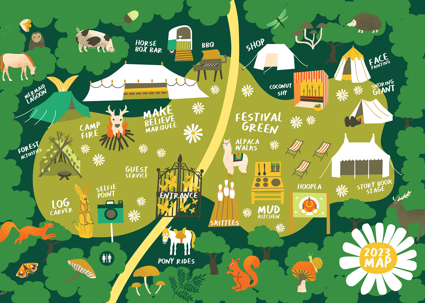
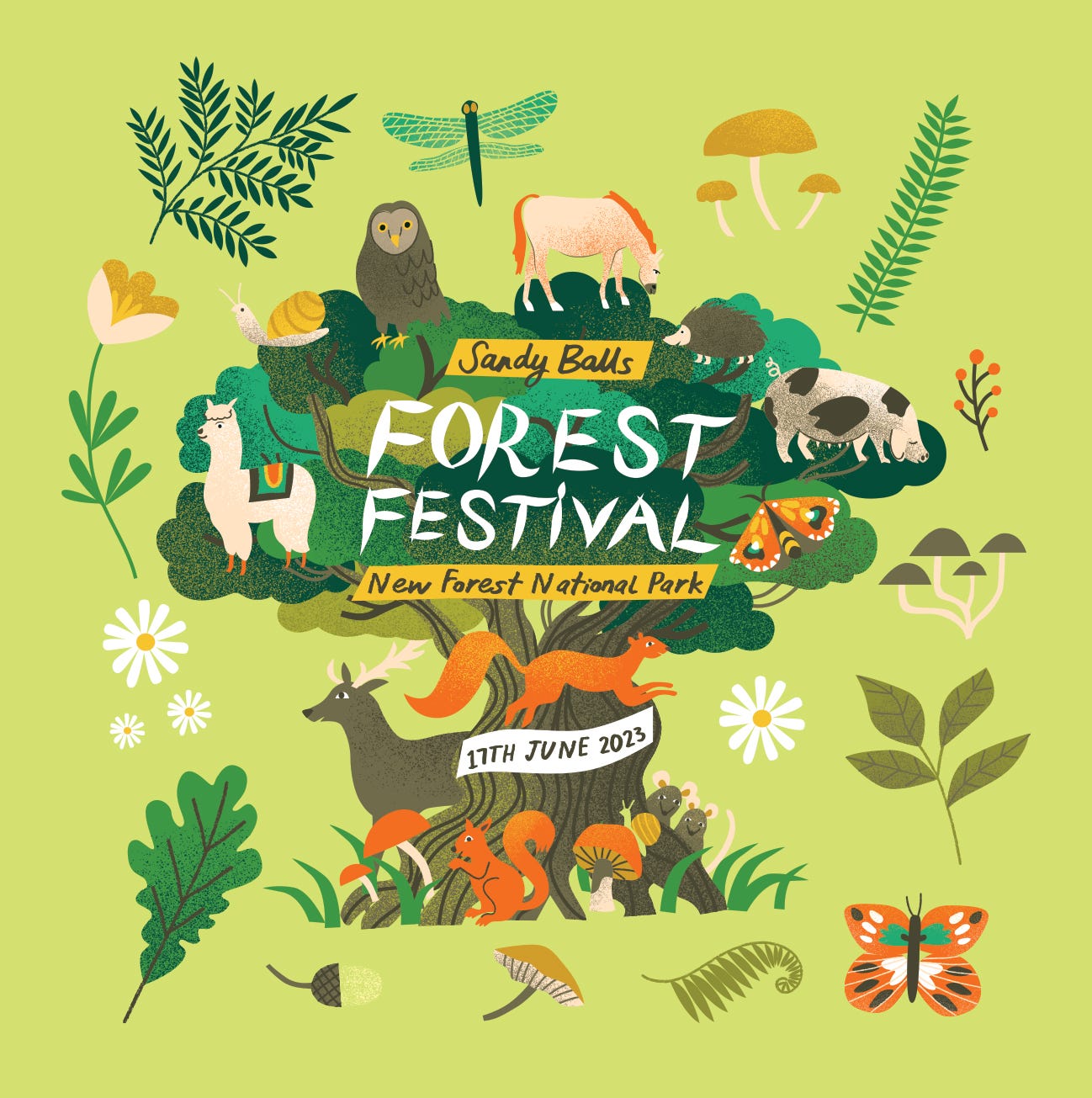
Summer Forest Festival | Client: Sandy Balls, Away Resorts
This project involved the creation of the Forest Festival brand identity, a map and a set of animal characters and icons to represent it. The map features the variety of different activities happening across the site. The images were used across Sandy Balls and Away Resorts marketing and festival signage to advertise the Summer festival. A fun and playful job that allowed me to have creative freedom.
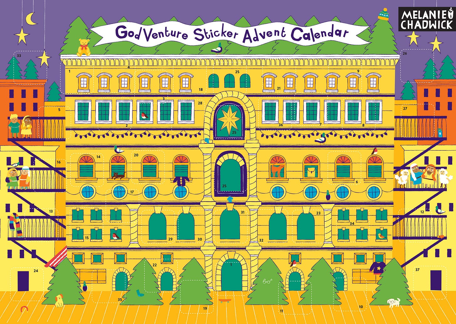
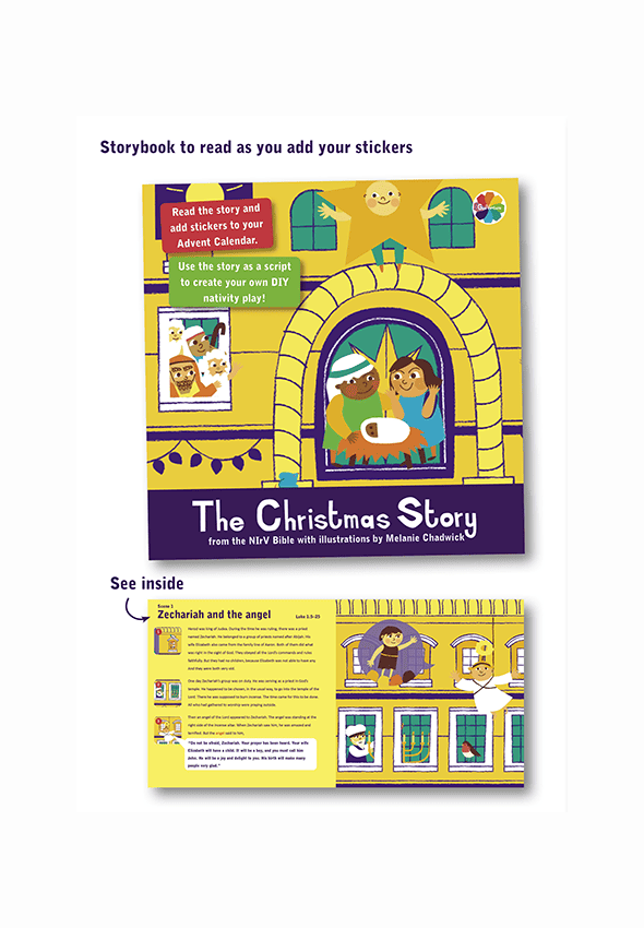
2023 Advent Calendar | Client: GodVenture
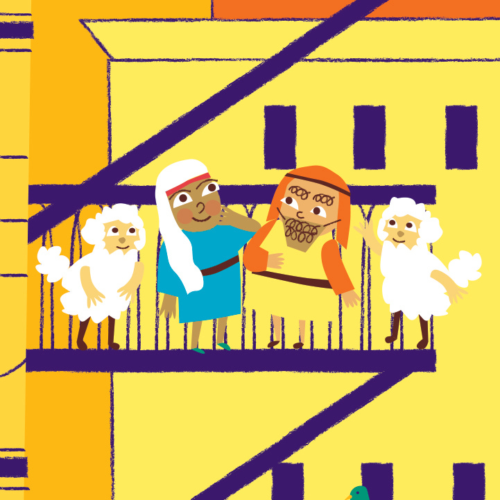
This project involved the creation of a cast of child characters taking part in a Nativity production to tell the Christmas story. Each year GodVenture commissions an illustrator to produce an inspiring Sticker advent Calendar. This year instead of a geographical telling of the story I suggested a stage production where the action is told around a large house. I thought this would be a fun way to tell the Christmas story and each day stickers are added to tell a bit more of the story revealing new characters and situations.
In from the cold | Editorial | Client: Ferment Magazine
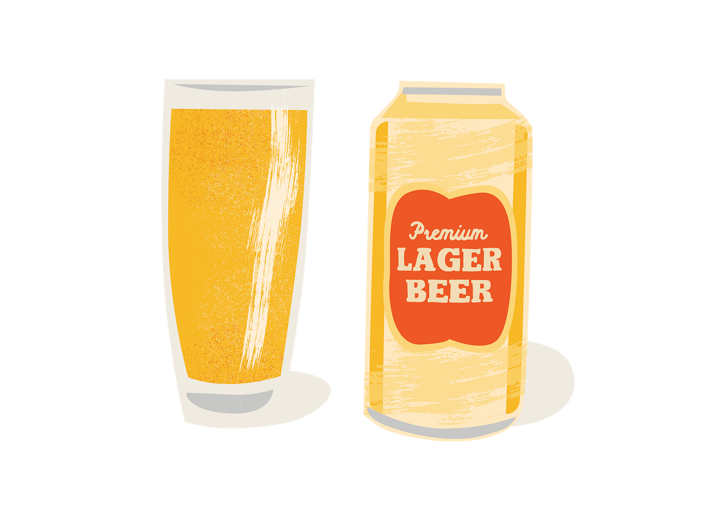
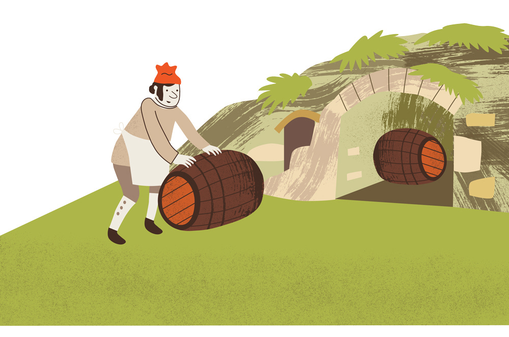
Usually I create illustrated maps for Ferment Magazine which you can see here, but for the Oktoberfest edition issue 96 I was commissioned to illustrate an article editorial. The subject was on the establishment of lager from a Bavarian cave, to global behemoth to craft darling. 7-8 images were created to run alongside the article which included a map, implements used for beer activities, beer cans and glasses and men brewing, storing and drinking beer. I also sneaked in a furry friend in one of them too.
I hope you enjoyed the show! I’ll be back with more sketchbook pages, another explore and draw podcast and news soon.







Very interesting look at your illustration work. Just a naive question though: why does all the work, even for different companies and events, seem to adhere to the same colour palette of greens, orange, and browns mostly? Is this a personal style choice, or is it a printing/business choice that is out of your control? Is it so it is recognizably "Melanie Chadwick"?
Loving these blogs/blogs, etc.
Leahbeth